Description
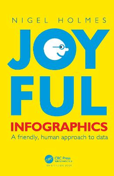
In Joyful Infographics: A Friendly, Human Approach to Data, one of the leading graphic designers of recent times shows how a judicious use of humor can make infographics more understandable. Written in non-academic, easy-to-understand language, and with historical and contemporary visual examples presented throughout, this small book provides a short history of light-hearted graphics. The text outlines nine clear ways to make graphics more understandable, explores the importance of the audience, shows you how to make information come alive during presentations through live-action 'performance' graphics, discusses why joy and smiling are good for you, and shows you how not to overdo it. The author website, featuring enlargeable graphics, can be found here: https://www.joyfulinfographics.com/.
Even if a subject is delicate, controversial, or taboo, being graphically friendly to the audience is the right way to explain it. It is the opposite of being clinically cold and just presenting the facts. If you can get readers to smile--the smile of recognition when they understand the graphic--you are more than halfway toward getting them to continue reading, and understanding, the intention of the piece. Joyful Infographics teaches you how to do just that.
About the Author
Nigel Holmes has written ten books (now eleven!) on information design and infographics. He is the former graphics director at Time magazine, has lectured globally, and has taught at Stanford and Yale. His diverse list of clients includes the BBC, Ford, Heinz, BMW, Sony, Estee Lauder, and Apple, and his work has appeared in a wide range of media including the New York Times, Rolling Stone, Esquire, Sports Illustrated, New Scientist, National Geographic, Scientific American, and the New Yorker. He has given three TED talks, his work has been exhibited internationally, and he is the recipient of multiple awards, including the Lifetime Achievement Award from The Society of News Design, and the Ladislav Sutner Award.
Reviews
"This glorious project positions the word muse in the larger word amusing. Nigel's modesty and the extent of the publications and innovations that he has brought uniquely to the profession of graphic design, information design, information architecture, explanation design and illustration is certainly enough to put him in the pantheon of the finest graphic designers of the late 20th and now the 21st century. He is one of my muses."
-Richard Saul Wurman, Architect, Graphic Designer, Author, and Founder of TED
"This is essential reading for information professionals, academics and students. Arguments about the way that information should be presented have been going on for decades. This subject resonates with anyone in the field, professional or academic. When presenting information, the balance between a serious approach and a lighter one is always a factor. It is all about engaging the intended audience. "
-John Grimwade, School of Visual Communication, Ohio University, USA
"Nigel Holmes has helped shape the standards of modern infographics like no other. His infographics are easily accessible, well-structured and - of course - fact-based. Nigel's body of work spans all types of infographics: charts, factual representations, and maps. They are memorized quickly and their information can be remembered accurately: this is mainly because they are designed to be light-hearted, humorous and confident. How Nigel plans, develops and designs infographics is a lesson par excellence. That's why Nigel Holmes' infographic work is not only required reading for my students: Understanding Nigel's approach to infographic design and his infographics' internal structure must be understood by my students in order to pass the course. This book will be in our library."
-Michael Stoll, Augsburg University of Applied Sciences, Germany"
Nigel's fantastic work feeds the need to learn from the past in order to create more work like this today. It is a fantastic guide that informs as much as it entertains."
-Jason Forrest, Editor-in-Chief, Nightingale: the journal of the Data Visualization Society
"One of the best things with Nigel's graphics is his approach, the stories are always smart and contemporary, with a good balance of information and humor. Readers will be inspired to read information in this positive way."
-Fernando Gomez Baptista, National Geographic
"Few things are as important for designers now as being able to effectively translate big data into memorable, meaningful, and concise graphics. Nigel Holmes has spent decades fostering human connection and understanding through joyful infographics. In this book, he applies his world-renowned brainy and playful approach to teach the next generation of graphic communicators how to master his craft."
-Amanda Hostalka, Dean, School of Design, Stevenson University, USA
"I am a huge fan of Nigel Holmes' ability to infuse joy and humanity into science graphics. He even managed to inject life into an explanatory diagram about group theory and the mathematical underpinnings of symmetry, providing brilliant design details that acted as a welcoming gesture for folks new to the topic."
-Jen Christiansen, senior graphics editor, Scientific American
"Sign and symbol languages appear to be enjoying a 21st century renaissance as part of the expanding universe of digital data visualization. New ways of presenting the floods of data on literally everything has made it necessary to increase data literacy. What better way than through humor? Who better than the data viz pioneer, Nigel Holmes?" -Steven Heller, Author, co-chair MFA Design, School of Visual Arts, USA
"Nigel Holmes is terrific."
-Tim Harford, Author, Senior Columnist, Financial Times
"Joyful Infographics itself is as friendly as Holmes's graphic design work. The book is filled with examples of imaginative infographics. And he draws from a wide range of examples; readers can study visuals from fields as diverse as human physiology, advertising, and the Olympic games. Holmes also grounds his work in history: Chapter 3 traces visual representations of information throughout history, referencing everything from the Chauvet cave paintings to Henry Beck's Tube maps, from the Bayeux Tapestry to emojis. Holmes also provides actionable instructions for designers. Chapter 4 offers nine techniques to make infographics more engaging, and Chapter 9 warns "Don't do this!" and provides examples of how not to design infographics. Following his guidelines will help designers keep the humanity in their visual communication. In a time when many communication professionals are wondering how much of our work artificial intelligence can do, it's a good reminder that it takes the human touch to communicate data in a way that audiences want to engage with."
--Elizabeth Hardin, University of Alabama, USA, Technical Communication, Volume 70, Number 3, August 2023
Book Information
ISBN 9781032115580
Author Nigel Holmes
Format Paperback
Page Count 209
Imprint Taylor & Francis Ltd
Publisher Taylor & Francis Ltd
Weight(grams) 476g


